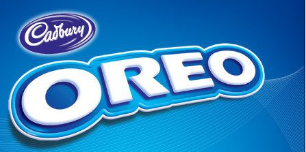
I have always liked the Oreo logo. I believe that this logo displays a great use in color-contrast. I like how the logo is very easy to read, how the letters "pop", and use of colors in it.
|
|
AuthorWrite something about yourself. No need to be fancy, just an overview. Archives
May 2015
Categories |
 RSS Feed
