I have always liked the Oreo logo. I believe that this logo displays a great use in color-contrast. I like how the logo is very easy to read, how the letters "pop", and use of colors in it.
|
|
|
I have always liked the Oreo logo. I believe that this logo displays a great use in color-contrast. I like how the logo is very easy to read, how the letters "pop", and use of colors in it.
0 Comments
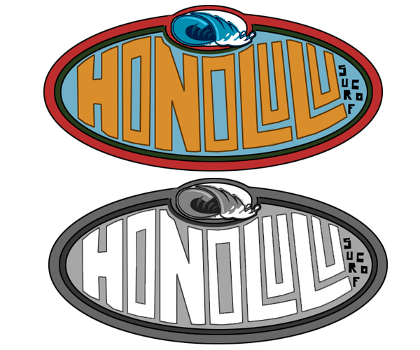 For this project, I had to create a logo of a Hawaiian Surf Shop. I chose to use the capital of Hawaii, which is Honolulu. I decided to make the shape on the logo an oval, in order to represent a surf board. I chose the colors blue, orange, dark green, black, white, and red. I chose these colors because they remind me of the beach when I see them all together. I know that surfing is a part of the Hawaiian culture, so I decided to put a wave at the top of the logo. This project really brought out my true creativity.
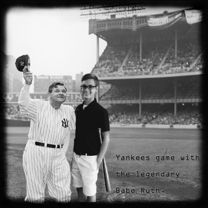 This was one of our first immensely creative projects. Our task was to add yourself to a picture of a historical icon, and I chose Babe Ruth. What I like about this picture are the effects that I used to make the viewer believe I was actually in the photo that was taken. The effect I used the most was the blur effect. Phot's taken back then were not as clear as the phots
|
AuthorWrite something about yourself. No need to be fancy, just an overview. Archives
May 2015
Categories |
 RSS Feed
